
In the past year, smartphone sales went up to more than 1.5 billion units worldwide. Around the same numbers continue when we look at tablet shipments and deliveries. These figures are very surprising, and they make us ponder over the impact on mobile websites and website owners.
Smartphones, tablets and other mobile devices have been responsible for connecting billions of people with the internet. Out of this, internet traffic through mobile contributes more than half of all the traffic, worldwide. Thus it becomes essential to make your website mobile-friendly.
Website owners should now make websites keeping mobile users their top priority. Gone are the days, where desktop responsiveness and optimization alone shaped your revenue.
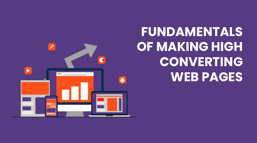
We are now in the mobile era, and to make you survive here, we will articulate the Fundamentals of making High Converting Mobile Web Pages.
Conversions and responsiveness
A lot of the people in the IT industry think these factors are similar but turns out driving conversions through a mobile web page is a much more complex process than making it mobile-friendly or responsive.
No doubt, responsiveness is an integral aspect of conversion and is generally the first step in process of website development but it independently can’t increase your click-through-rates.
Since 2015, Google started preferring mobile-friendly and responsive websites to improve the experience for its users. This preference by Google initiated the need for website owners to focus on mobile-friendliness and user experience as much as possible.
If suppose, websites became extremely mobile-friendly, now the question arises how can they improve the conversion rates? To be honest, responsiveness is more focussed on aligning the website up and down.
If images on a website are scaled in a proper proportion on a 6.0 -inch device, then it’s a responsive website. But usually, responsiveness is something, the user is not concerned about. In fact, the user notices how fast those elements are rendered on to his/her device?
Bounce rates soar high when the content is not properly visible on the mobile device. Such issues on the mobile website crash down conversion rates and damages the business. In this blog, we’ll have a look at things that are responsive in nature but also holds the ability to convert users.
Remove unnecessary content from the mobile version
The very first thing before developing a website for mobile is determining which content you’ll show on the device. You need to consider the small screen of the device and put, not long but relevant content only. A user will not read everything, but only the content that he thinks is pleasing for himself. As a designer, this is your job to show him what he needs to see.
Now the content can be trickled down to three major aspects: Headline, Font size and Content.
Headline
A headline is probably the first and foremost thing a user notices on a webpage. A headline is your chance to make the user stay or to bounce him back, it is the moment that even determines your website’s perception.
Focus on putting a long tail heading, doing this forces users to scroll the whole page to find something useful for them. Although generating trust in users is important by adding your achievements on the web page but a user also needs to find something which they can use. They pay more attention to how they can be benefitted rather than what you have to offer. One important point to keep in mind is that a user makes up his mind regarding the website in less than 1 second.
A user who’ll need scroll from up to bottom and reading just about your achievements will likely bounce.
Font size matters
Font size, an essential part of a landing or any other page for that matter. It also determines the conversion rate of your website. Generally, for long forms of content, a font-size of 16 pixels is chosen to enhance readability. A font of 14 pixels is also preferred at times, but you should avoid it as there are a large fraction of visually impaired people who need to be taken into account.
Appropriate Keywords
The next aspect to remember while presenting content to the user is to use relevant and specific keywords. As you might know, smartphone screens are very small, typically people have a phone having 5.5 – 6.0 inches of display size. With the aforementioned meagre time and smaller space in your hands, you would want to acquire a user’s trust quickly so that he remains on the website and does not bounce back.
Begin this process by removing all the redundant and loose words. Words such as “many”, “very”, “extremely” etc. are termed as “fillers” and they sound irritating. Use brevity in your writings, and keep it concise.
After you’ve eliminated redundancy it’s now time to insert relevant keywords. Pitch these keywords to help users convert through the web page. Choose such keywords that your user can trust upon. The user should be convinced that you’re the best without you claiming yourself the best. Use minimal but impactful words that show your experience, confidence, and professionalism.
Thumb-zoned
The thumb zone is the region on the mobile screen that determines how easy or hard it is for our thumb to reach a certain point. Research claims that 49% of people use their mobile phones with a single hand and only a meagre 15% with two hands. And among those 49% of people, 67% of them use their right thumb. So designing a web page’s UI/UX becomes extremely important.
Gone are the slow days
Google claims that for users to stay on your website, it should get loaded in less than 2 seconds. Its been a long time since we have left the 2G era when people had the patience to wait a minute for the website to get load. Now as we progress towards 5G, the patience timer has reduced significantly.
For every problem, there’s a solution. And here are some ways you as a developer can decrease loading times and in turn ensure higher conversion and lower bounce rates.
· Reduce the weight of elements
An essential factor in determining the loading speed of a website is the weight of its elements. Often websites use many elements in pursuit to lure the users which slows down the loading speed.
The main culprit is the images. Providing high-quality images radically decreases the conversion rates. Try not using high-quality images which are not related to the product such as background or thumbnails. Inserting high-quality images without compressing them can increase the size of the page significantly.
Developers can cut up to 300 KB which would reduce the size of the website by 25-30% of the website by simply compressing the images. Image format can help you in decreasing the load time too. 46% of mobile-friendly websites choose JPEG and 28% choose PNG. The reason why JPEG is used extensively is that it loses bits in the compression process. JPEG is used when not much focus is to be given on detail of the image like landscapes, background colour shades etc. Whereas PNG is lossless and doesn’t lose the bits in the process. PNG is used when details, sharpness and observations are required.
· Get a good server
Servers play an essential role as they not only communicate with requests but also send the first byte to the user. Google suggests a time of 1.3 seconds for communication of mobile server with the first byte. The lower the better.
- Request count optimization
Reducing the number of requests to the server shortens the overall page load time. The less there are no. of requests, the fewer elements there are to fetch.
- Improve the display content
A good way to start loading a page is to code the web page to display, not all but something to the user as soon as possible. Show partial content first whenever the user loads up your page. This will ensure the user stays on the page for a longer period of time.
Final Words
So these were the fundamentals of how could you make high converting web pages. Every aspect of making a web page matters, be it content or server selection. Wondering who we are? We are Sampark Infoways, an all-round IT solutions company in Raipur, Chhattisgarh, India. Check out our website for more details regarding the solutions we provide. Follow our blog to read more about such interesting topics. Till then we’ll see you in our next blog.